How it Was Made: Emerald Isles
Last week, the seascape I posted earlier here showed up on link-sharing powerhouse Reddit. It caused a bit of a stir since it is a copyrighted image and was rehosted and posted without my permission. A lot of the photographers in r/photography and r/pics, where it was originally posted by a user, made it known that it was me who had created the work. I’m very grateful for both the exposure that posting gave me, and even more grateful for the support I received from my fellow photographers and Redditors.
After the image was posted, I noticed a lot of people claiming that there was no chance this was taken in Ocean City, New Jersey. I also received a long slew of messages asking me how I made this image. I thought I’d both prove it was and explain my process here for anyone who is interested.
First things first. I got lucky with this image. My wife, who is a beach bum, had been dying to get to the Jersey shore, which is a quick jaunt from our home in Philadelphia. It was mid-May and we figured it would be warm enough for our son, who was 13-months at the time, to walk around a bit and experience the beach for the first time. We were dead wrong. It was drizzly, foggy, and just awful, but we made the drive hoping it would clear up. Regardless, it was just nice to be out of the house. I had been wanting to make some long-exposure seascapes, but getting up early or being out late when the light is great is tough to manage when you’re a sleep-deprived parent. But this miserable day was a gift, given that I could work with the mist and fog and not have to worry about terrible noon light.
The subject of this image, the jetty and old pier remains, are all over the beach in Ocean City, New Jersey. I had my pick of the litter, but I settled for one near where my wife and son stopped to get pizza. I had an older body with me (a Nikon D200) that I wasn’t too worried about dropping into the ocean. It was set up on a tripod just past the were the waves died out on the beach with a 17-70 lens – one I wasn’t worried about losing, either – mounted to it. On the end of the lens was the secret weapon, a Hoya ND400 9-stop neutral density filter, which allows long exposures even in bright light. Dialing the aperture to f/22 let me extend the exposure time to 25 seconds, allowing the not-too-rough water to take on the silky look in the end result. I don’t generally like to go up to f/22, since image quality starts to suffer, but I wanted the longer exposure time here and made the sacrifice. The shutter was fired with a cable release. That’s all there was to the exposure, really. I made about 10 frames, varying the shutter speed from about 10 seconds to 30, checking the histogram until I saw what I wanted.
Before I move on to processing, a few tips about working with a 9-stop ND filter …
1. Make sure you compose and focus before screwing on the filter. The glass is so dark you won’t be able to do so unless your camera has live view.
2. Buy the biggest filter you need. My Hoya ND400 is 77mm, which is the largest filter size any of my lenses takes. It’s always better to buy large and then add a step-down ring for your smaller lenses rather than have to buy multiple filters.
3. Don’t be afraid to stack filters. If this were a sunnier scene, I would have likely added a graduated neutral density filter to balance the sky and foreground, but everything was fairly even. Lucky for me because I forgot to bring one.
4. Invest in decent glass. Cheap filters can degrade image quality and/or add color casts to your image. Sure, the casts are curable in post-production, but I like to spend my time shooting and not in front of the computer.
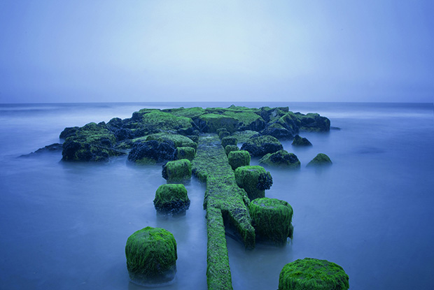
OK, so on to the processing. Here’s the zeroed RAW file. Nothing has been done but correcting the distortion of the lens and straightening the horizon a bit (my tripod sunk into the sand a little because of the undertow).
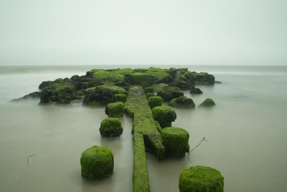
You’ll notice a few things imediately … the sky is flat and boring. The water is ugly. There’s a bunch of crud on the lens. Pretty uninteresting, right? All it has going for it is the nice green color, which, I hope, is proven to be natural now. Truth be known, I really didn’t spend a lot of time on this image. I added about a quarter stop of exposure, a touch of brightness, made sure I had solid white and black points, and added a simple s curve to the tone curve. After that, I reached into the landscape photographer’s bag of magic tricks and went for my favorite tool, changing the white balance. A simple flip in Lightroom to a tungsten white balance adds a magical blue color that’s seen in the final image. I did jazz the image up a bit in Nik Color Efex, using the detail extractor filter at about 15 percent opacity, as well as the darken/lighten center filter. And that’s it.
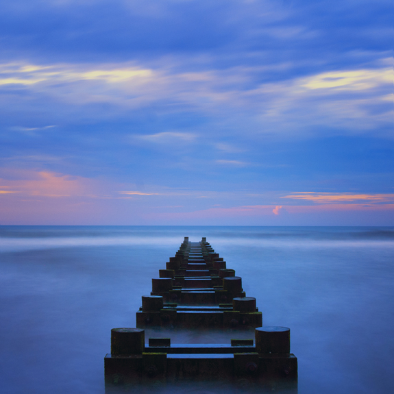
Here’s another that was made in pretty much the same manner, though this was at sunrise down in Wildwood Crest. The difference here, though, is that the white balance was shifted to fluorescent to accentuate the pink and purple tones.

As an amateur photographer, I’m always interested in techniques used by experienced photographers. I don’t use any of the tools you have at your side (yet), but it makes me consider the possibilities if I did. Someone it seems impossible to take those mind-blowing magazine cover shots, but posts like this remind me that it isn’t supernatural magic that occurs, it’s simple knowledge and practice. Thank you for the post.
Thanks, Alex! Appreciate your comment and stopping by.
Thanks for posting this on your site and Reddit. As a serious hobbyist (wink), I always love tutorials like this. I almost always use Lightroom to adjust things, but for some reason, I never thought of adjusting the white balance to a totally different setting to highlight certain colors.
No problem, Susan! Glad you found it helpful. Thanks a bunch for stopping by!
Could you possibly give some explanation (or link me to something) that goes into more detail about the fluorescent white balance? How does that accentuate the pink and purple? I’ve always used the daytime or cloudy presets if I don’t feel like doing a custom preset…
Also found this from your post on reddit. Thanks!
Hi, Jonathan,
I won’t pretend to be smart enough to answer the why. I just know that it works.
[…] About the author: Dominic Mercier is a photographer, writer, and graphic designer living and working in the Greater Philadelphia area. In addition, he works as the communications director for the Philadelphia Chapter of the American Institute of Architects. Visit his website here. This post was originally published here. […]
[…] About the author: Dominic Mercier is a photographer, writer, and graphic designer living and working in the Greater Philadelphia area. In addition, he works as the communications director for the Philadelphia Chapter of the American Institute of Architects. Visit his website here. This post was originally published here. […]